this is such an odd thing for me to be writing about…
sort of.
I’ve only been to New York once.
I’ve been interviewing a lot of people who live there though.
my Podcast analytics actually just told me that my biggest audience is in New York, not biggest after where I live, not biggest outside of Canada, but somehow the majority of my listens are coming from NYC lately…
crazy, I know.
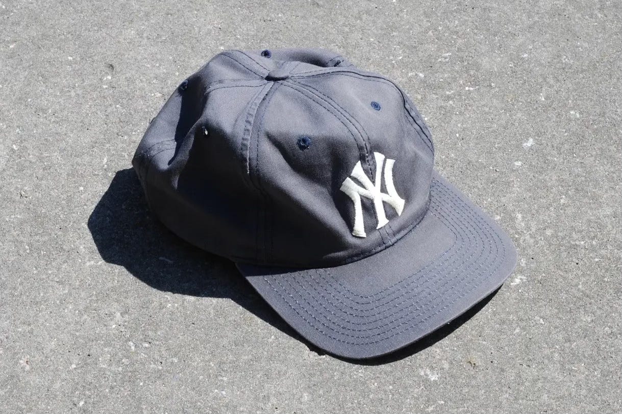
but I bought a Yankees’ hat because of it.
you know that thing when you get a car, or you’re looking at a car, and you start to see it everywhere?
Yankees’ hats are everywhere.
it got me asking…
what’s the most famous sports logo ever?
what’s actually the most famous logo ever?
that’s how I came to learn all this…
The New York Yankees’ interlocking "NY" logo is one of the most recognizable symbols in all of sports…
arguably one of the most recognizable logos ever actually.
for sure transcending solely baseball.
It doesn’t just represent a team, but an entire culture of theoretical success, long-standing tradition, and genuine Americana.
However, the history of this iconic logo is rich, and layered though.
with lore going back well over a century.
The story of the Yankees’ interlocking "NY" logo actually begins with the New York City Police Department (NYPD)…
in 1877, Louis Tiffany, son of the famous jeweller Charles Lewis Tiffany, designed a medal of valour for the NYPD.
the medal, originally intended to honour officers who displayed extraordinary bravery, featured an interlocking "NY" monogram that would later become the basis for a new iteration of the Yankees' logo.
This design was significant in the 19th century, as it represented the city of New York in a unified and elegant form.
merging the letters "N" and "Y" into a single, intertwined emblem.
the use of such monograms was not entirely uncommon in heraldic designs, but the specific style created by Tiffany had a distinct flair that would resonate well beyond its initial intent and purpose.
Louis Tiffany, already well-known for his work in jewelry and decorative arts, approached the design of the monogram with a sense of artistry and symbolism.
his goal was to create a piece that not only honored the bravery of New York’s finest…
but also captured the essence of the city they served.
Tiffany's design combined the ornate elegance of the Victorian era, with a modern simplicity.
ensuring that the emblem would be both timeless and meaningful.
the intertwining of the letters "N" and "Y" was done in a way that suggested unity and strength, qualities that the NYPD, and later the Yankees, would come to embody.
this monogram, though initially intended for a small audience, was obviously destined to become an enduring symbol of New York itself.
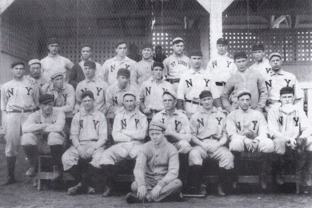
The New York Yankees, originally known as the New York Highlanders, were established in 1903 after moving from Baltimore.
where they had been known as the Orioles...
initially, the team’s uniforms did not feature the interlocking "NY" logo.
instead, they wore a more generic "NY" insignia, along with a variety of other designs in their early years.
In 1909, the Yankees (still the Highlanders at the time).
adopted the interlocking "NY" on their uniforms, likely influenced by its use on the NYPD medal of valour.
by then, the team had already begun to be referred to as the Yankees, and the new logo was an innovative way to cement their identity within the city.
the decision to incorporate the logo into their uniforms marked the beginning of what would become one of the most enduring and iconic symbols in sports history.
The early 1910s saw the team transition fully into the New York Yankees name.
the interlocking "NY" became a fixture on their caps and uniforms.
the logo evolved ever slightly over the years, with minor adjustments to its proportions and style, but its core design remained consistent.
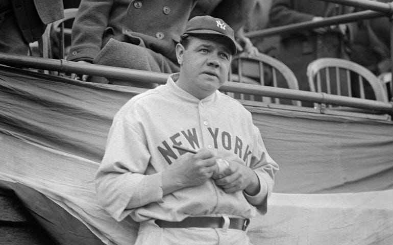
by the 1920s, under the ownership of Jacob Ruppert, and the on-field leadership of Babe Ruth.
the Yankees were emerging as a dominant force in baseball, and their logo began to take on an iconic status.
I don’t know how to fit this in…
but this intel is too good not to impose...
*Babe Ruth, one of baseball's most iconic figures, played for the New York Yankees from 1920 to 1934 but never wore the now-famous Yankees "NY" logo on his uniform during his playing years.
this is because the Yankees' home uniforms, which featured the interlocking "NY" logo on the chest, were only worn during a few seasons in the 1910s, before Ruth joined the team.
from 1920 onward, the Yankees' home uniforms featured a plain pinstriped design without the logo, sans logo entirely.
while their road uniforms had "New York" spelled out across the front.
the familiar "NY" logo didn't return to the Yankees' home jerseys (reinstated in 1934) until after Ruth's retirement.
making it one of the few iconic baseball symbols that Ruth never donned during his legendary career.*
One significant change came in 1947, when the Yankees introduced an even newer version of the logo with a more streamlined and symmetrical design.
this iteration, created by longtime Yankees equipment manager Pete Sheehy, closely resembles the modern version seen on the team today.
the updated logo was sharper and more balanced.
perfectly fitting the team’s growing reputation for precision and excellence.
As the Yankees’ success continued through the decades, their logo became synonymous with winning.
it was no longer just a team emblem, it was a symbol of the Yankees’ storied history and the dynasty they were building.
the interlocking "NY" became a badge of honour, worn by legends like Lou Gehrig, Joe DiMaggio, Mickey Mantle, and Derek Jeter…
at this point, the Yankees’ logo has transcended the world of sports to become a global symbol of New York City itself.
whether on a baseball cap, T-shirt, or piece of merchandise…
the interlocking "NY" is worn by millions around the world, often by people who may not even be fans of the team (or even fans of sports in general).
the logo has come to represent the spirit of New York, and its resilience, ambition, and larger-than-life presence.
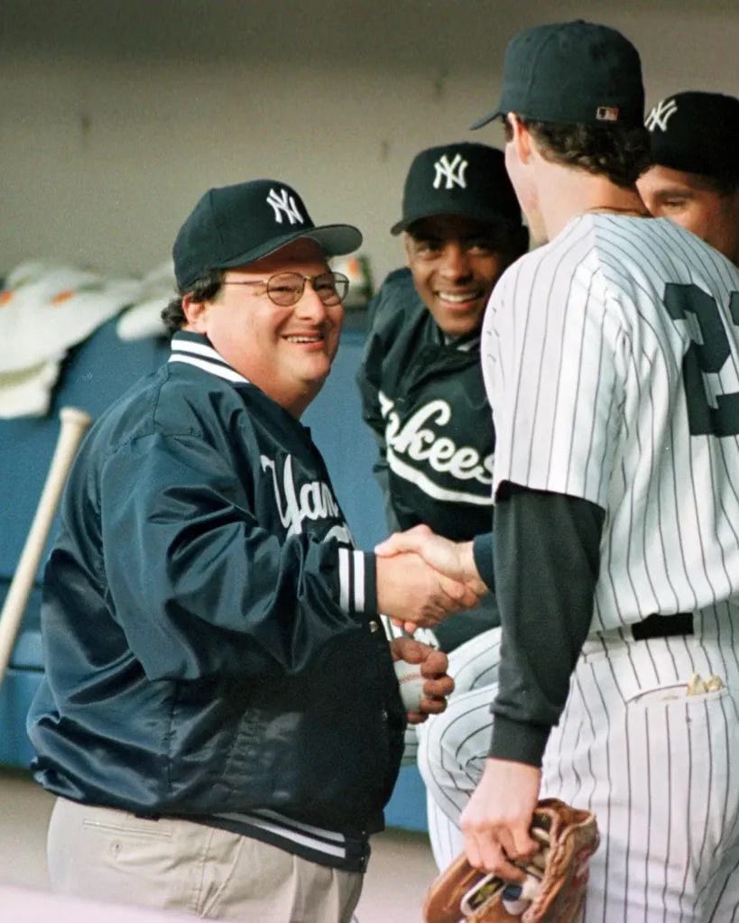
The logo's influence has eternally permeated fashion, music, and pop culture.
it has been embraced by artists, musicians, and celebrities, further solidifying its status as a cultural icon.
from Lorne Michaels and Queen Latifah, to Newman from Seinfeld…
I think it’s probably safe to say, the interlocking "NY" has a vast significance that goes well beyond the baseball field.
Today, the Yankees’ interlocking "NY" logo remains largely unchanged from its mid-20th century design.
it is a living testament to the enduring power of a well-crafted emblem, one that has remained relevant for over a century.
as I’ve said, the logo represents more than just a baseball team.
it is a symbol of excellence, tradition, and the city of New York itself.
As the Yankees continue to build on their legacy, the interlocking "NY" logo remains a constant, a reminder of the team's rich history and its impact on sports and culture. Whether seen on the field at Yankee Stadium or on the streets of cities around the world…
the logo stands as a timeless emblem of a team and a city that have always aimed to attempt to be the best.
and its trajectory from a medal of valour to one of the most recognized symbols in the world is something I personally feel should be talked about a bit more…
its narrative is forever intertwined with the history of New York City, the rise of the Yankees as a sports dynasty, and the broader cultural significance it has gained over the years.
thanks for reading!
enjoy the rest of your week.


